During conversations with customers we often stumble across interesting ways customers update, organize and add content in Confluence. Some additions are more creative than others, but one thing that is lacking all too often is a well thought out method for managing content. It can simply be a case of a team growing rapidly, which results in an increase in the number of users adding content in Confluence as well as the amount of content, and suddenly it's a mess.
Thinking about the pace, the structure and the lifecycle of the content in Confluence is crucial to avoid the mess and collaborate better. Here we take you through some of the most common content management errors.
Avoid these and you will avoid the headache, lost productivity and low engagement caused by a dysfunctional Confluence.
Flaw 1: Random formatting
Updating content within a page by using various random formatting options is a surefire way of creating messy content. They say that creative minds often keep a messy workplace. Unfortunately, this idea doesn't apply so well to Confluence (or in life).
Messy content doesn't facilitate creativity, it tends to undermine it. Formatting on a Confluence page works when there is a purpose behind it (e.g., bold a heading if you want it to stand out), and when it is consistent (one colour throughout).
For instance, if the purpose is to send clear instructions to a user, use steps. We humans find it easy to consume content that is in lists and easy steps. This is why every second blog post is titled X ways to xxx.
Stay away from:
- Colored highlighting
- "WAS" and "TO BE" signs
- StrikeThrough
Use:
- 1 purpose per page
- Steps and lists (see UI Toolkit)
- Consistent formatting
- Images
Flaw 2: Content all over the place
Neglecting to structure and organize your content can lead to content chaos. Adding structure means content is organized into their relevant, and homogenous homes.
Achieve structure and organization easily using Refined for Confluence. It's available for both Confluence Data Center and Cloud. The cloud version has similar functionality in terms of how you can structure and organize content, but it also allows you to publish a custom, branded intranet site outside of Confluence accessible from a custom URL.
Spaces can be organized into categories. Pages can be filed using UI Children and spaces can have navigational page trees for fast access to relevant documentation.
Best practice is to come up with a plan for which overarching categories are most important to your users, which spaces sit under those, and then which pages sit under the spaces. Then add the content to the relevant home as you go.
Don't shoot yourself in the foot and wait until you have a ton of content to organize. Create content hierarchy early and if you find something that should be archived, set up an archiving configuration with Better Content Archiving and put things where they belong.
Flaw 3: Keeping irrelevant content, rather than archiving it
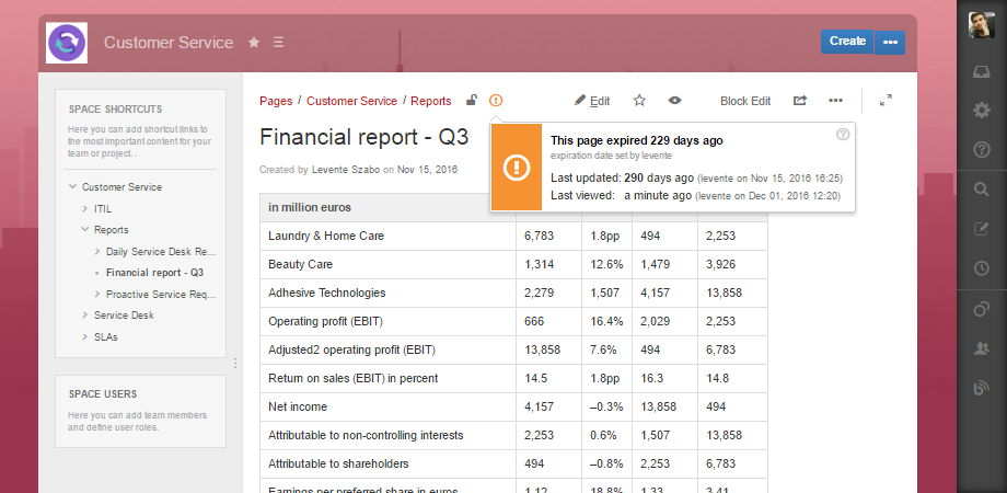
Keeping irrelevant content among up to date and relevant content is an easy bad habit all too easy to fall into. Some information goes stale faster than others, so you have to define what does "outdated" or "not needed" mean in each case. Your Confluence is a living thing: contributors are coming and going (but mostly coming), creating different type of content in Spaces with different lifecycles.
Configure a fitting archiving rule in Better Content Archiving, and let it move irrelevant or old content automatically to an Archive Space. For example, a page dedicated to Atlassian Summit in 2016 would now be outdated, but the content may still be useful in future. Archive it, to keep your Confluence clean and without losing the content you may need to return to. This way all your content stays in a secure, easy-to-search place, but completely out of your team's way.
Viewing the page status calculated by Better Content Archiving in a Refined Wiki themed space
Flaw 4: Displaying content that nobody gives a toss about
Displaying content your user doesn't use, or isn't relevant just adds to the white noise we are all overwhelmed by each day. When displaying content, 'know your audience' and think about making it easy for the user.
There are an abundance of features within both Better Content Archiving and Refined Theme for Confluence fit to help a team archive what not needed and to navigate to find what matters. As an example, if Confluence is used as social intranet, the HR team could have their own archiving policy assigned to their space that fit the type of content they work with. To access what's relevant using Refined Theme, they can use an HR category and directly on their HR category dashboard read the latest activity from their department.
Finally, a great tip for content management is to consistently update the information. Structures might be solid, but they are not permanent. Bend them and shape them to suit.
Both Better Content Archiving and Refined Theme facilitate straightforward management of content as you go so that an updated, clean and modern Confluence is a reality.
Improve your Confluence content quality!
Use this guide from Atlassian to learn more on how to build an enterprise-ready ECM solution on Confluence.

