
In this page
Prerequisites
Why use charts?
Drawing charts in Jira PDF exports
For the impatient
Collecting the input data for charts
Inserting chart images to PDF
Examples
Line chart: created vs resolved issues
Pie chart: issues by status
Bar chart: issues by assignee
Complex visualizations
Charts
Prerequisites
Please read generic script development with Better PDF Exporter first. This tutorial assumes that you know how to write scripts for the app.
Why use charts?
Charts are visual representations of Jira data. Charts often make it easier to understand the data in business reports, because readers can easily pick out patterns and trends illustrated in the charts that are otherwise difficult to see when looking at raw numbers.
Drawing charts in Jira PDF exports
For the impatient
In case you are not very interested in how it works behind the scenes (or you already know that), you can use the charts.groovy mini library (shipped with Better PDF Exporter) to render charts from Jira data to PDF exports. The benefit of using this mini library is that you can focus on your custom data collection- and chart customization logic, not on the repetitive plumbing code.
How to use it?
- Execute the library Groovy script in your template code with this single line:
## issue-fo.vm $scripting.execute("charts.groovy") - Implement the method to collect data and build the dataset for JFreeChart:
// MyReport.groovy PieDataset getMyDataset(issues) { // collect the data here and transform it to a dataset that JFreeChart expects return dataset } - Implement the chart customizer callback:
// MyReport.groovy def getMyCustomizer() { return { chart -> // customize the chart here, setting colors and other properties } } - Pass these two, along with desires dimensions of the chart image, to the corresponding method of the $charts object. Insert the returned Base64 encoded chart image to your PDF:
## issue-fo.vm

<fo:external-graphic content-height="4cm" src="data:image/png;base64,$chart.drawPieChart($myReport.myDataset, $myReport.myCustomizer, 400, 200)"/>
Done. Congratulations!
Please read the following sections to get a better understanding of the details.
Collecting the input data for charts
Your work starts with collecting the data that you want to visualize. This usually includes processing the input set of issues (typically returned by a Jira filter or JQL query), and performing calculations on them.
Say, you just want to draw a piechart that shows the status distribution of the issues. For this, you should simply iterate over those issues, get the status name of the current item and increment the corresponding counter in a mapping from status names to status counts.
At this point you must understand that the chart images themselves will be created with the wonderfully rich and flexible JFreeChart library (see a quick catalog of charts). This affects the way you collect data. In case of doubts: Jira is using the same library to render its standard built-in charts, so JFreeChart is already a part of your Jira instance.
You have your data in some format by now, but you have to transform that to the format in which JFreeChart expects it. You could, of course, prepare the data immediately in JFreeChart's preferred format, but in our experience it is better to utilize libraries designed specifically for data processing in the first step, and then make another transformation to convert the data to JFreeChart datasets.
Different types of charts require different type of datasets. See this quick list about the most important base types:
| Chart type | Dataset type | Also includes |
|---|---|---|
| Line chart | TimeSeriesCollection | Timeseries-, step- and other XY charts. |
| Pie chart | PieDataset | 3D- and multi-pie charts. |
| Bar chart | CategoryDataset | 3D-, stacked-, grouped and horizontal bar charts. |
As soon as you have your dataset, you can actually create your chart object.
Inserting chart images to PDF
You can create the chart object by passing the dataset to the $charts object. Other arguments of this method call are a so-called customizer callback and the image dimensions in pixels. The customizer receives the $chart object (note the singular!) as its only argument, which is a valid instance of the JFreeChart object that represents your chart. As its name suggests, in the customizer you can apply customizations to the chart, like changing the colors from the defaults, change the orientation from horizontal to vertical, or hide the legend among others.
What the $charts does is that it creates $chart, invokes the customizer on that, renders the chart into a PNG image (in memory) and returns that PNG as a Base64 encoded string.
To insert the image to the PDF, use an <fo:external-graphic> element in the PDF template. Instead of referencing an external image file with an absolute URL, insert the chart image by using a so-called data URI. A data URI basically contains the mimetype (which is image/png here), the encoding (Base64 here) and the actual bytes of the image in Base64 encoded format. In your case, the FO code will look like this, the actual bytes appearing in the place of "...":
<fo:external-graphic content-height="4cm" src="data:image/png;base64,..."/>
Congratulations, you have your chart image exported in the PDF now! Continue reading through the examples.
Examples
Here are some real life examples for rendering the basic chart types. Whilst they are usable "as is", they can also be used as starting point when developing other charts.
The source code shown in this section can be found in the hello-charts.groovy and the matching hello-charts-fo.vm files that are shipped with the app as default resources.
Line chart: created vs resolved issues
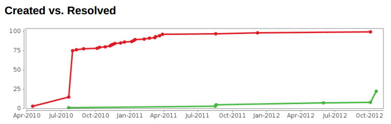
This is one of the most popular standard charts in Jira, which you can now customize and export to PDF reports!
Here is how it works. For each issue, we calculate on which day it was created and which day it was resolved (if it is resolved at all). We collect the map from days to issues created on that day using a Multiset, and do similarly for issues resolved in a given day. Then we transform this data to two separate timeseries datasets (this is the input for JFreeChart), and during the tranformation we sum the values so that the chart becomes "cumulative". We finally return a timeseries collection that contains both timeseries. In the customizer, we configure the chart not to fill the area under the lines (as that may not be ideal for prints), plus we set the colors and shapes to be used for drawing.
Data collector:
TimeSeriesCollection getCreatedVsResolvedDataset(issues) {
	def createdByDay = new TreeMultiset()
	def resolvedByDay = new TreeMultiset()
	issues.each {
		createdByDay.add(new Day(it.getCreated()))
		if(it.resolutionDate) {
			resolvedByDay.add(new Day(it.resolutionDate))
		}
	}

	def createdSeries = new TimeSeries("created")
	int cummulativeTotal = 0
	for(day in createdByDay.elementSet()) {
		cummulativeTotal += createdByDay.count(day)
		createdSeries.add(day, cummulativeTotal)
	}

	def resolvedSeries = new TimeSeries("resolved")
	cummulativeTotal = 0
	for(day in resolvedByDay.elementSet()) {
		cummulativeTotal += resolvedByDay.count(day)
		resolvedSeries.add(day, cummulativeTotal)
	}

	def dataset = new TimeSeriesCollection()
	dataset.addSeries(createdSeries)
	dataset.addSeries(resolvedSeries)

	return dataset
}
Customizer:
def getCreatedVsResolvedCustomizer() {
	return { chart ->
		chart.plot.renderer = new XYAreaRenderer()
		chart.plot.renderer.plotLines = true
		chart.plot.renderer.plotShapes = true
		chart.plot.renderer.plotArea = false

		chart.plot.renderer.setSeriesStroke(0, RenderingUtils.LINE_STROKE)
		chart.plot.renderer.setSeriesPaint(0, CREATED_COLOR)
		chart.plot.renderer.setSeriesShape(0, RenderingUtils.CIRCLE_SHAPE)

		chart.plot.renderer.setSeriesStroke(1, RenderingUtils.LINE_STROKE)
		chart.plot.renderer.setSeriesPaint(1, RESOLVED_COLOR)
		chart.plot.renderer.setSeriesShape(1, RenderingUtils.CIRCLE_SHAPE)
	}
}
FO:
<fo:external-graphic content-height="4cm" src="data:image/png;base64,$chart.drawTimeSeriesChart($helloCharts.getCreatedVsResolvedDataset($issues), $helloCharts.createdVsResolvedCustomizer, 800, 200)"/>
Pie chart: issues by status
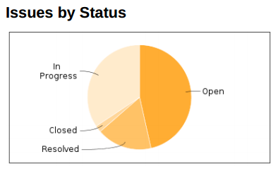
This is the simplest of all examples.
We count the occurrence of all status using a Multiset (from Guava), then transform it to the corresponding pie dataset. Finally, we customize the chart to use a color gradient.
Data collector:
PieDataset getIssueCountByStatusDataset(issues) {
	def statusCounts = new HashMultiset()
	issues.each {
		statusCounts.add(it.statusObject.name)
	}

	def dataset = new DefaultPieDataset()
	statusCounts.elementSet().each {
		dataset.setValue(it, statusCounts.count(it))
	}

	return dataset
}
Customizer:
def getIssueCountByStatusCustomizer() {
	return { chart ->
		chart.plot.baseSectionOutlinePaint = RenderingUtils.BACKGROUND_COLOR
		chart.plot.drawingSupplier = new GradientDrawingSupplier(chart.plot.dataset.itemCount)
	}
}
FO:
<fo:external-graphic content-height="4cm" src="data:image/png;base64,$chart.drawPieChart($helloCharts.getIssueCountByStatusDataset($issues), $helloCharts.issueCountByStatusCustomizer, 400, 200)"/>
Bar chart: issues by assignee
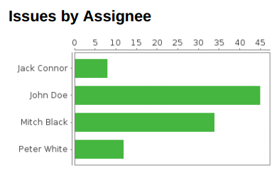
Although this chart type is different from the previous one, the code is fairly similar.
We count the issues for each assignee, also increasing a separate counter for the unassigned issues. We customize the chart to be horizontal and to paint the bars with green.
Data collector:
CategoryDataset getIssuesByAssigneeDataset(issues) {
	def issuesByStatus = new TreeMultiset()
	issues.each {
		if(it.assignee) {
			issuesByStatus.add(it.assignee.displayName)
		} else {
			issuesByStatus.add("Unassigned")
		}
	}

	def dataset = new DefaultCategoryDataset()
	issuesByStatus.elementSet().each {
		dataset.setValue(issuesByStatus.count(it), "count", it)
	}

	return dataset
}
Customizer:
def getIssuesByAssigneeCustomizer() {
	return { chart ->
		chart.plot.orientation = PlotOrientation.HORIZONTAL
		chart.plot.renderer.setSeriesPaint(0, RESOLVED_COLOR)
		chart.plot.renderer.setSeriesOutlinePaint(0, RenderingUtils.BACKGROUND_COLOR)
	}
}
FO:
<fo:external-graphic content-height="4cm" src="data:image/png;base64,$chart.drawBarChart($helloCharts.getIssuesByAssigneeDataset($issues), $helloCharts.issuesByAssigneeCustomizer, 400, 200)"/>
Complex visualizations
OK, I understand these, but can I build reports that more complicated?
Yes.
Obviously, if you want to visualize more complicated data, your data collection code will be more complicated.
It is important to understand that you are not limited to the issues as the only input data. You can get other data from Jira (ex: versions, user accounts) and you can connect to external sources of data, like a web service.
The Groovy scripting facilities in the Better PDF Exporter app enable implementing business reports of any complexity. Groovy has well-documented libraries to process data or to connect to web services. As Java integrates nicely with Groovy, you can use any Java library, too! We, for instance, love using Guava for general data processing or Joda Time when working with time values.
Really, there are no limits to what you can do with this technique.
Questions?
Ask us any time.