
In this page
Confluence dashboards and gadgets
Status report
Status overview
Content list
Owner report
Space analytics
Content analytics
User analytics
User engagement
What is a Confluence report?
The Better Content Archiving app provides a wide range of Confluence reports that capture trends and real-time information about your spaces, pages, blogs, users, activities, and content status. These reports offer valuable insights into your Confluence site, helping you make informed decisions and improve your work with high-quality information.

You can view the reports through the various dashboards offered by the app. The most important common features of all dashboards:
- Dashboards are collections of gadgets that present information using key performance indicators (KPIs), charts and data tables.
- Dashboards are available in two scopes: for the whole Confluence site and for individual spaces.
- Dashboards are available for all users.
- Dashboards respect Confluence security (space permissions and content restrictions).
Confluence dashboards and gadgets
In this section you can find the list of the dashboards provided by the app and the gadgets on those.
Status report
The Status report dashboard offers key performance indicators (KPIs) and insights into the current state of your Confluence content, whether across the entire site or within specific spaces. It also monitors how content status evolves over time, helping you identify trends and areas for improvement. Guided by the principle that "you can't manage what you can't measure", this dashboard serves as an essential tool for tracking content quality and making data-driven improvements.
The Status report dashboard looks like this (example):
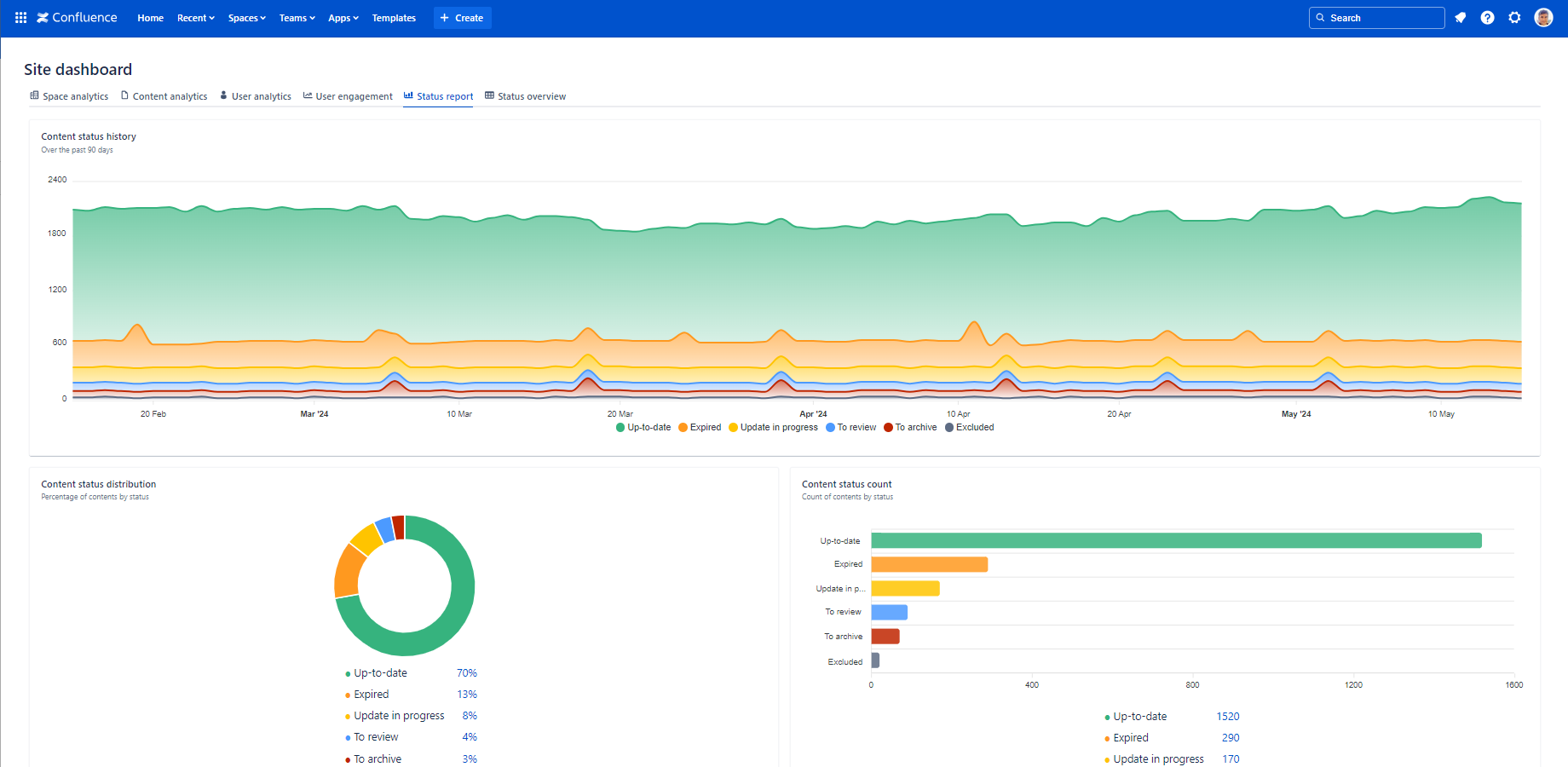
It provides the following gadgets:
Status overview
The Status overview dashboard shows the number of pages and blog posts by status and space, helping you quickly identify outdated content. It's the ideal tool for prioritizing updates and rewrites, ensuring your content stays current, relevant, and valuable to users.
The Status overview dashboard looks like this (example):
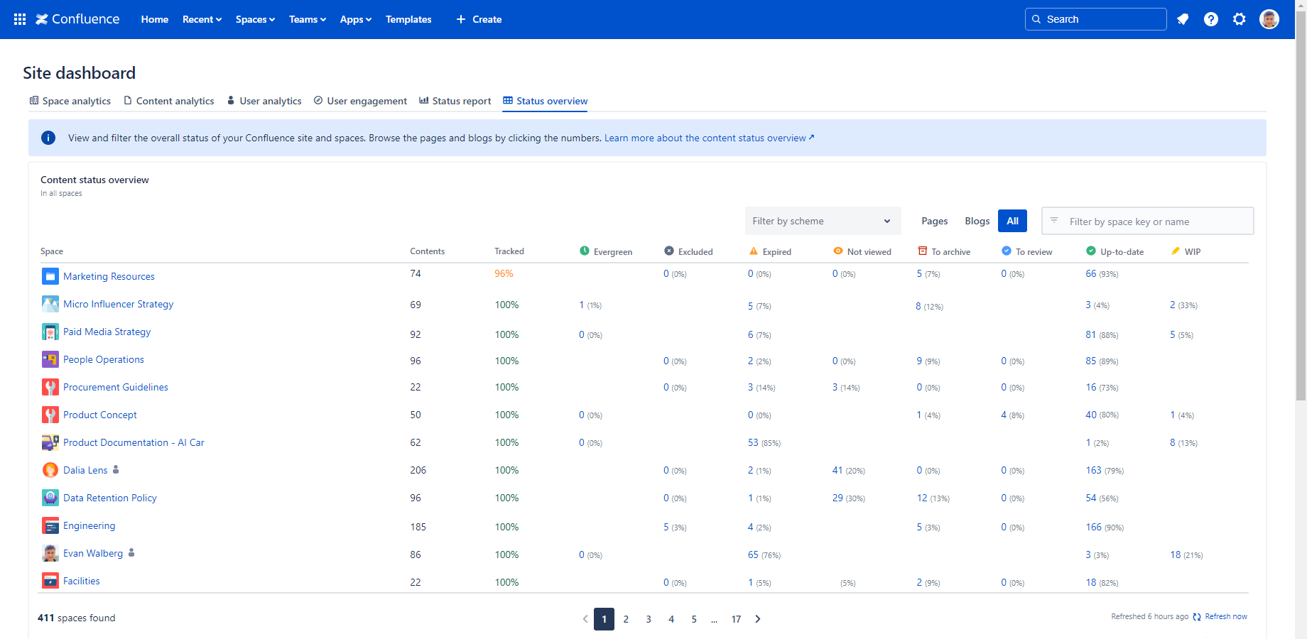
It provides the following gadgets:
Content list
The Content list dashboard provides a universal list of all your Confluence pages and blog posts, whether across the entire site or within specific spaces. It includes key information such as the content's status, owners, last update, and last view. This comprehensive overview allows you to easily identify outdated content, monitor content health, and take informed actions to maintain a high-quality Confluence environment.
The Content list dashboard looks like this (example):
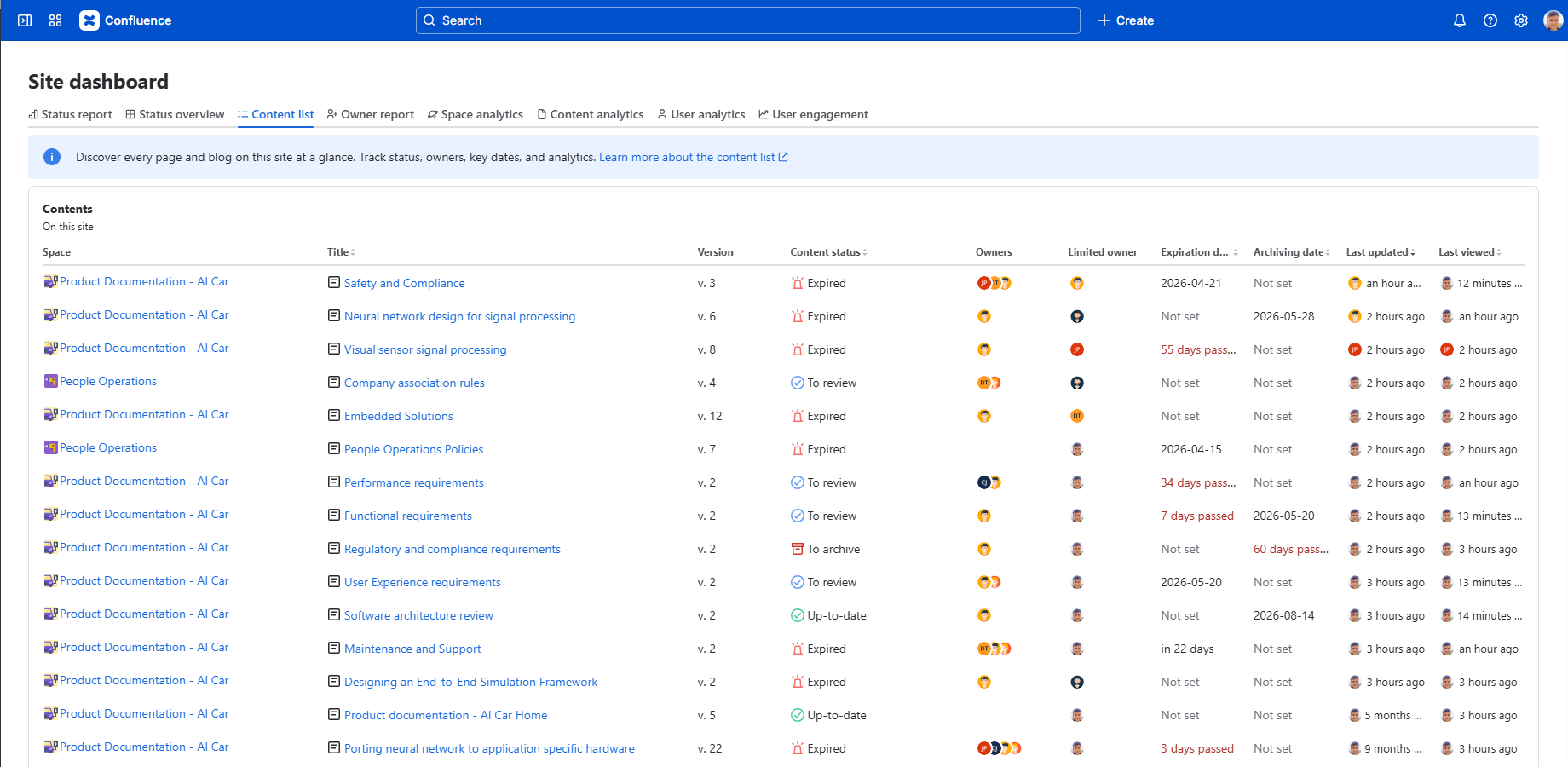
It provides the following gadgets:
Owner report
The Owner report dashboard provides a comprehensive view of content ownership across your entire site or within specific spaces. It shows what portion of contents your users own, how many users are content owners, and which users own the most content. Identify ownership gaps, redistribute responsibilities, and maintain accountability in your content management.
The Owner report dashboard looks like this (example):
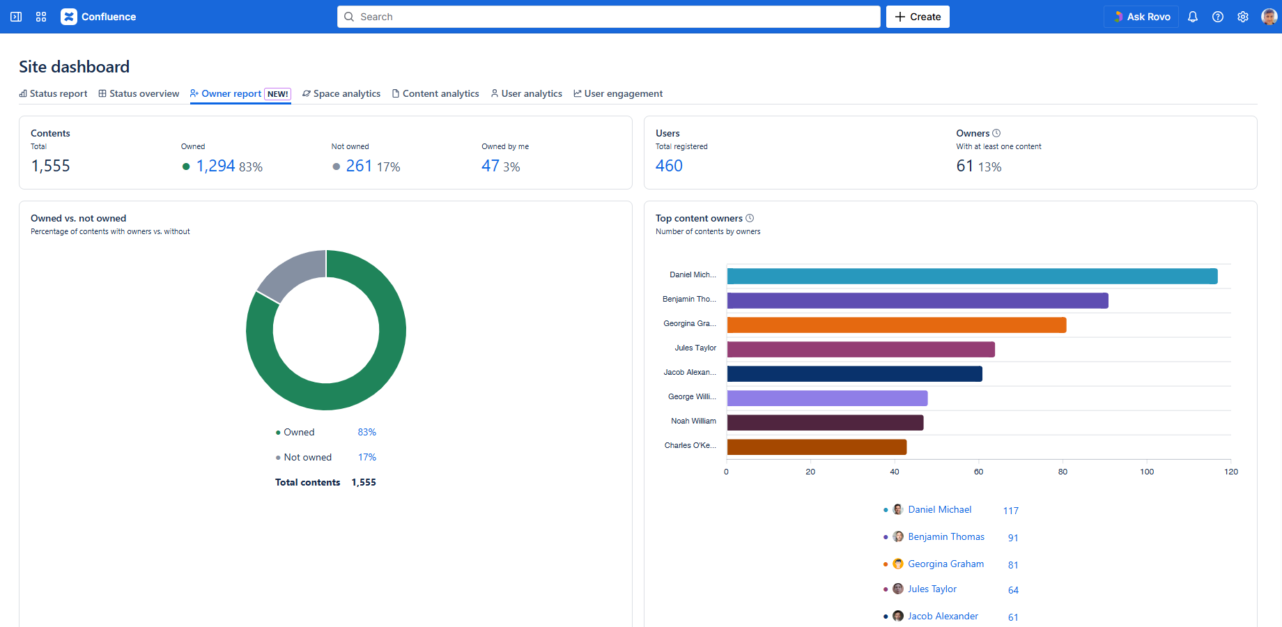
It provides the following gadgets:
Space analytics
The Space analytics dashboard provides a comprehensive view of key performance indicators (KPIs) and in-depth analytics for all your Confluence spaces. With this centralized tool, you can easily track, monitor, and assess the performance of each space in real time. Stay informed and make data-driven decisions with a clear, organized display of your spaces' metrics in one place.
The Space analytics dashboard looks like this (example):
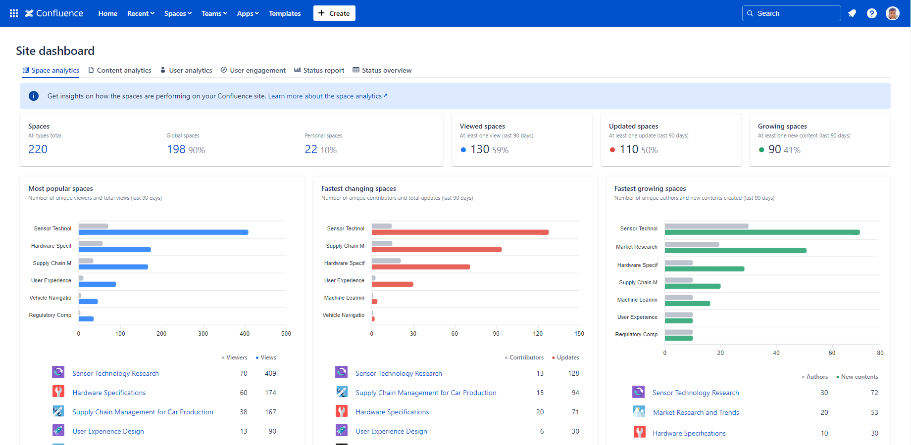
It provides the following gadgets:
- Spaces
- Global spaces
- Personal spaces
- Viewed spaces
- Updated spaces
- Growing spaces
- Most popular spaces
- Fastest changing spaces
- Fastest growing spaces
Content analytics
The Content analytics dashboard provides detailed KPIs and insights for your Confluence pages and blog posts. It enables you to track performance, uncover trends, and identify top-performing content, whether across your entire site or within specific spaces. With this tool, you can easily monitor effectiveness and make informed decisions to improve content quality.
The Content analytics dashboard looks like this (example):
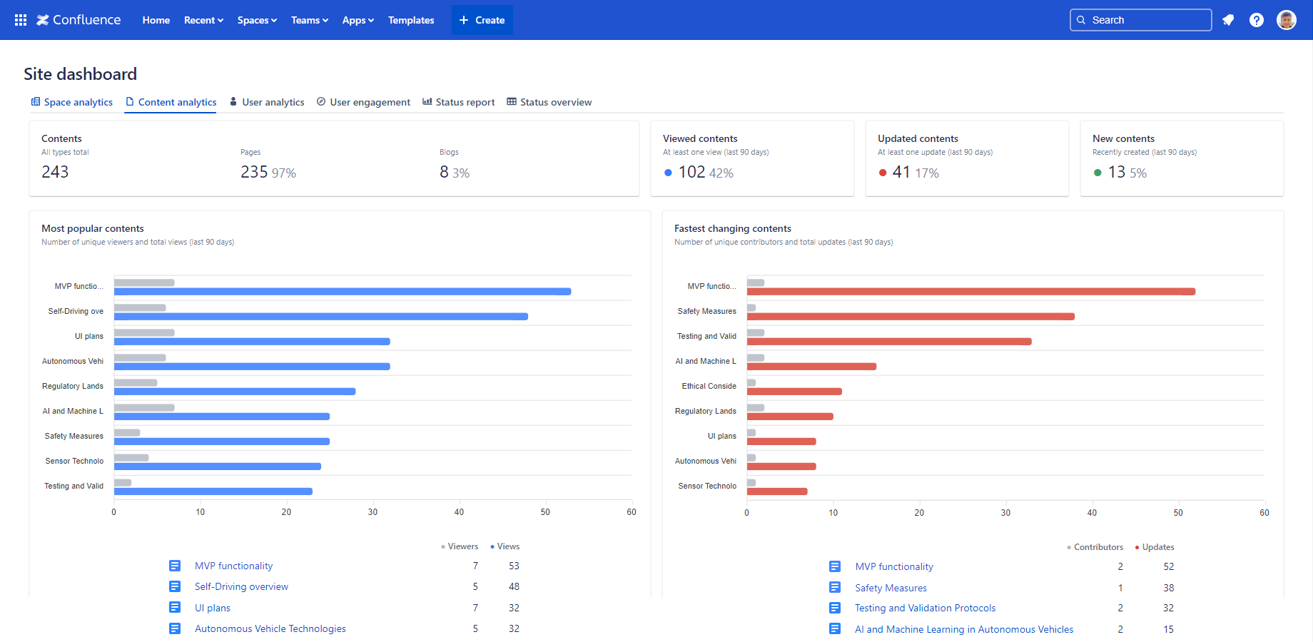
It provides the following gadgets:
- Contents
- Pages
- Blog posts
- Viewed contents
- Updated contents
- New contents
- Most popular contents
- Fastest changing contents
User analytics
The User analytics dashboard provides KPIs and in-depth analytics on user activity within your Confluence site. It allows you to track how users interact with your content and identify 'power users' who are the most active, whether site-wide or in specific spaces. Use these insights to enhance collaboration and improve content management.
The User analytics dashboard looks like this (example):
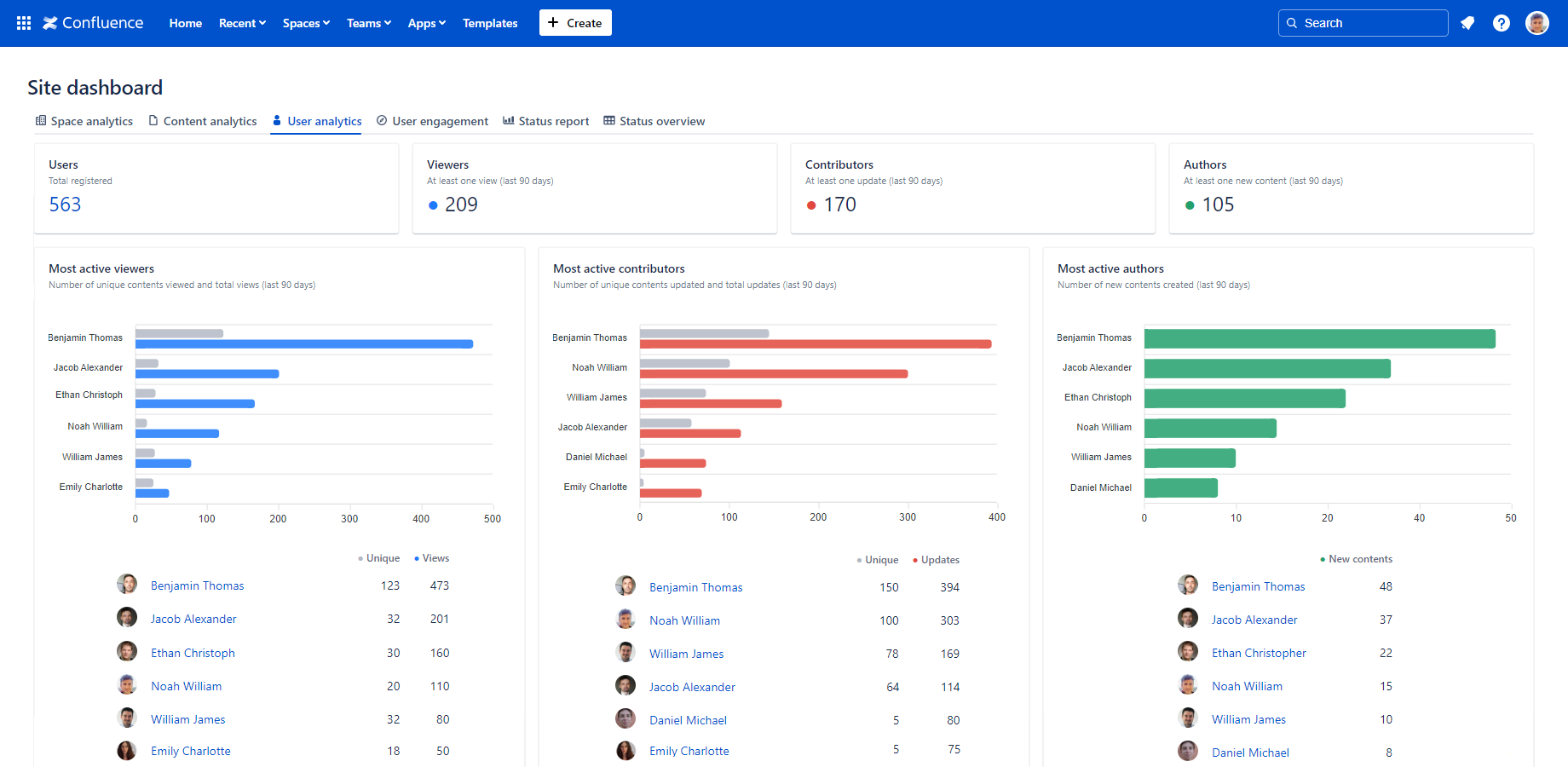
It provides the following gadgets:
User engagement
The User engagement dashboard provides key performance indicators (KPIs) and insights into how frequently users interact with your Confluence site or within specific spaces. It helps you assess whether users are actively engaging with the content and deriving real value from it, giving you a clear understanding of how your content resonates with its audience.
The User engagement dashboard looks like this (example):
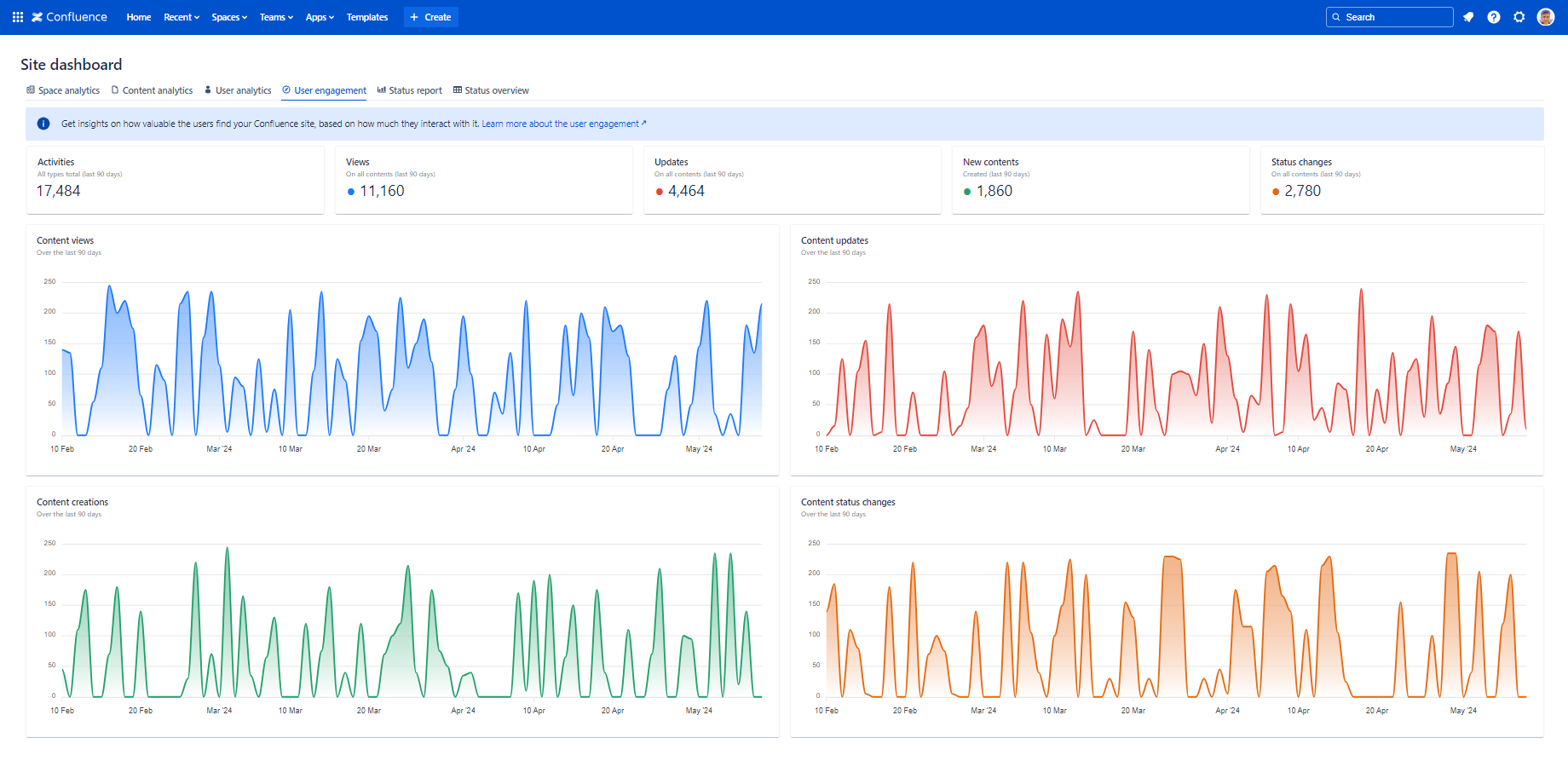
It provides the following gadgets:
- Activities
- Views
- Updates
- New contents
- Status changes
- Content views
- Content updates
- Content creations
- Content status changes
Questions?
Ask us any time.