
In this page
Scopes
Content Status report for the site
Content Status report for a space
Understand the Content Status report
Content status history
Content status distribution
Content status count
Security
What is the Content Status report?
The Content Status Report dashboard offers key performance indicators (KPIs) and insights into the current state of your Confluence content, whether across the entire site or within specific spaces. It also monitors how content status evolves over time, helping you identify trends and areas for improvement. Guided by the principle that "you can't manage what you can't measure", this dashboard serves as an essential tool for tracking content quality and making data-driven improvements.
Quickly learn how to access and use the Content Status Report dashboard:

Similar to other dashboards, the Content Status Report dashboard transforms data on spaces, pages, blogs and users into clear summaries:
- You can view the trend of content quality changes on the site or in the space.
- You can view the number and percentage of pages and blog posts by status on the site or in the space.
- You can browse the list of pages and blog posts by status.
Scopes
The Content Status dashboard is available for the whole Confluence site and for any single space.
Content Status report for the site
For the site scope report, expand the Apps section in the left-bar (not Space apps!) → click the Better Content Archiving app → Status report tab. In this scope, the report covers all spaces, all contents and all activities on the site.
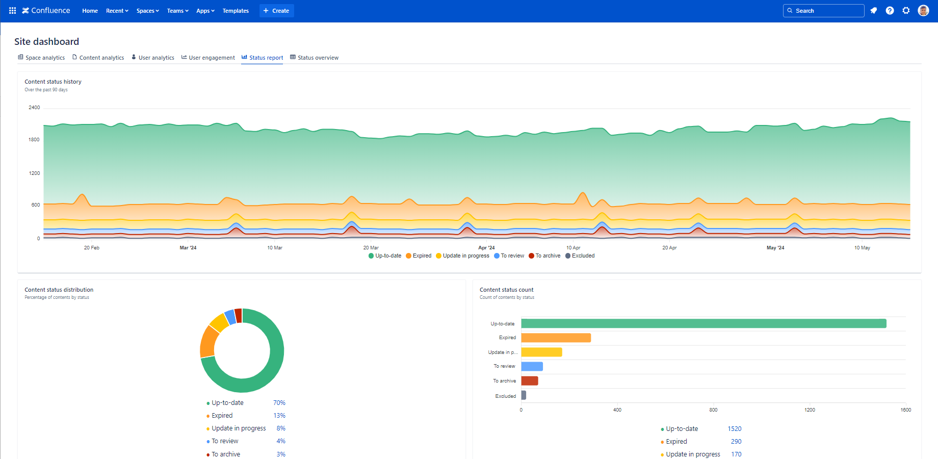
The report displays all statuses that are part of the content status schemes applied to at least one space.
Content Status report for a space
For the space scope report, go to the space → expand the Space apps section in the left-bar (not Apps!) → click the Better Content Archiving app → Status report tab. In this scope, the report covers only that single space, the contents and the activities in it.
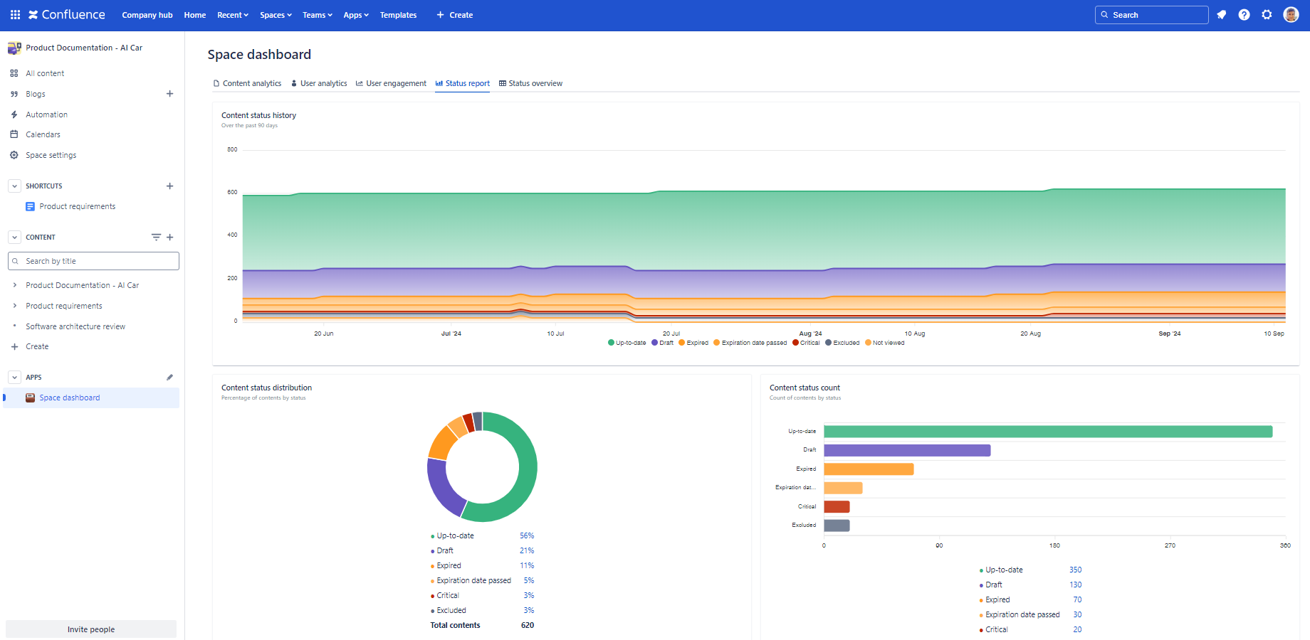
The report displays only those statuses that are added to the content status scheme applied to this space.
Understand the Content Status report
The following section helps you understand the Content Status report by explaining each gadget.
| Gadget | Description | Notes |
|---|---|---|
| Content status history |
The stacked area chart shows how the number of contents by status changes over time.
Hovering over the chart will reveal the number of contents by status on any given day. (There is one data point per day.) |
Assuming you use intuitive colors for page statuses, such as red for "bad" ones and green for "good" ones, large and growing areas of red indicate a high number of contents that needs action. Similarly, large (and growing) areas of green confirm that your content is of good quality. |
| Content status distribution |
Displays the percentage of contents by status.
You can click the percentage values to see the list of the pages and blogs in that status. The ring chart visualizes the ratios of different statuses relative to each other. (The sections on the chart are ordered in decreasing size, starting from the 12 o'clock position.) |
A "bad" page status in the initial sections indicates a high percentage of contents that needs action. Consider assigning Confluence page owners to ensure every page is actively managed. |
| Content status count |
Displays the number of contents by status.
You can click the number values to see the list of the pages and blogs in that status. The bar chart visualizes the count (frequency) of different statuses in comparison to each other. (The bars on the chart are ordered in decreasing size.) |
A "bad" page status among the top bars indicates a high number of contents that needs action. Consider assigning Confluence page owners to ensure every page is actively managed. |
Security
The Content Status Report dashboard is available for all users. The dashboard respects the Confluence space permissions and page restrictions.
More precisely:
- If the app can't access a space or content (page or blog post), it will not collect analytics about it.
- The Content status history chart shows the count of the contents accessible by the app that day. Counts of past days will not change at permission modifications.
- If you can't view a space, the contents in it will not contribute to the percentages at Content status distribution and the counts at Content status count.
- If you can't view a content, it will not contribute to the percentages at Content status distribution and the counts at Content status count. Also, it won't show up in the content list for that status.
As the dashboard is personalized for the user who opens it, your dashboard view and your teammate's may be different.
Questions?
Ask us any time.