

In this page
Create, edit, and delete notification email templates
Edit a notification email template
Factory default notification email templates
Customize email subject and content
Work with Handlebars
Data types
Limited collection types
DTO types
Helpers
Error handling
Recipes
Display the current status for each content
Display the last content status transition for each content
What is a notification email template?
It is critical to send the exact, personalized information your recipients need, exactly at the right moment. Well-written notification email templates, with a custom subject and body, are crucial for that. Notification email templates don't work standalone. They work as part of a notification scheme.
Create, edit, and delete notification email templates
Configure notification email templates by navigating to Confluence Settings (cog icon "⚙" in the top right) → Apps → Better Content Archiving → Configuration → Notification configuration → Notification email templates tab.
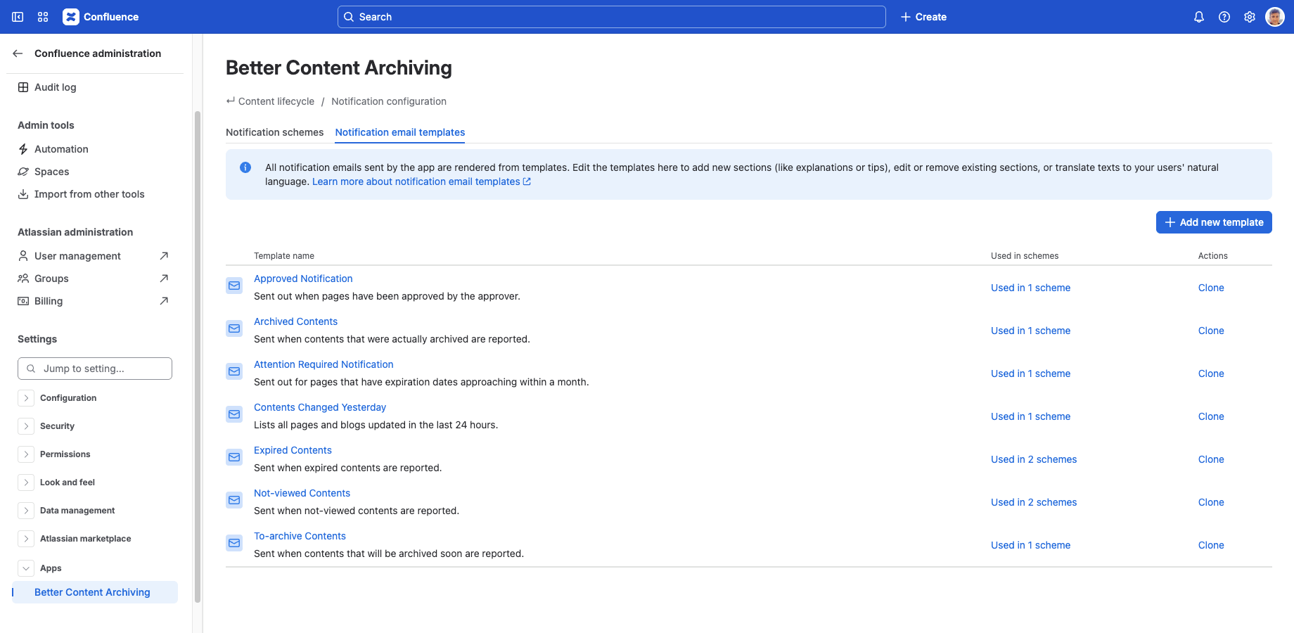
The notification email template list has the following columns:
- Template name: The name and description of the notification email template.
- Used in schemes: The number of notification schemes which use this template. Click it to show the list of those schemes on the Notification schemes tab.
- Actions: Clone creates a copy of the template. Delete deletes the template, if it's not used in any notification scheme.
Edit a notification email template
Create a new notification email template by clicking the Add new template button on the right above the notification email template list. Click the name of a notification email template to edit it.
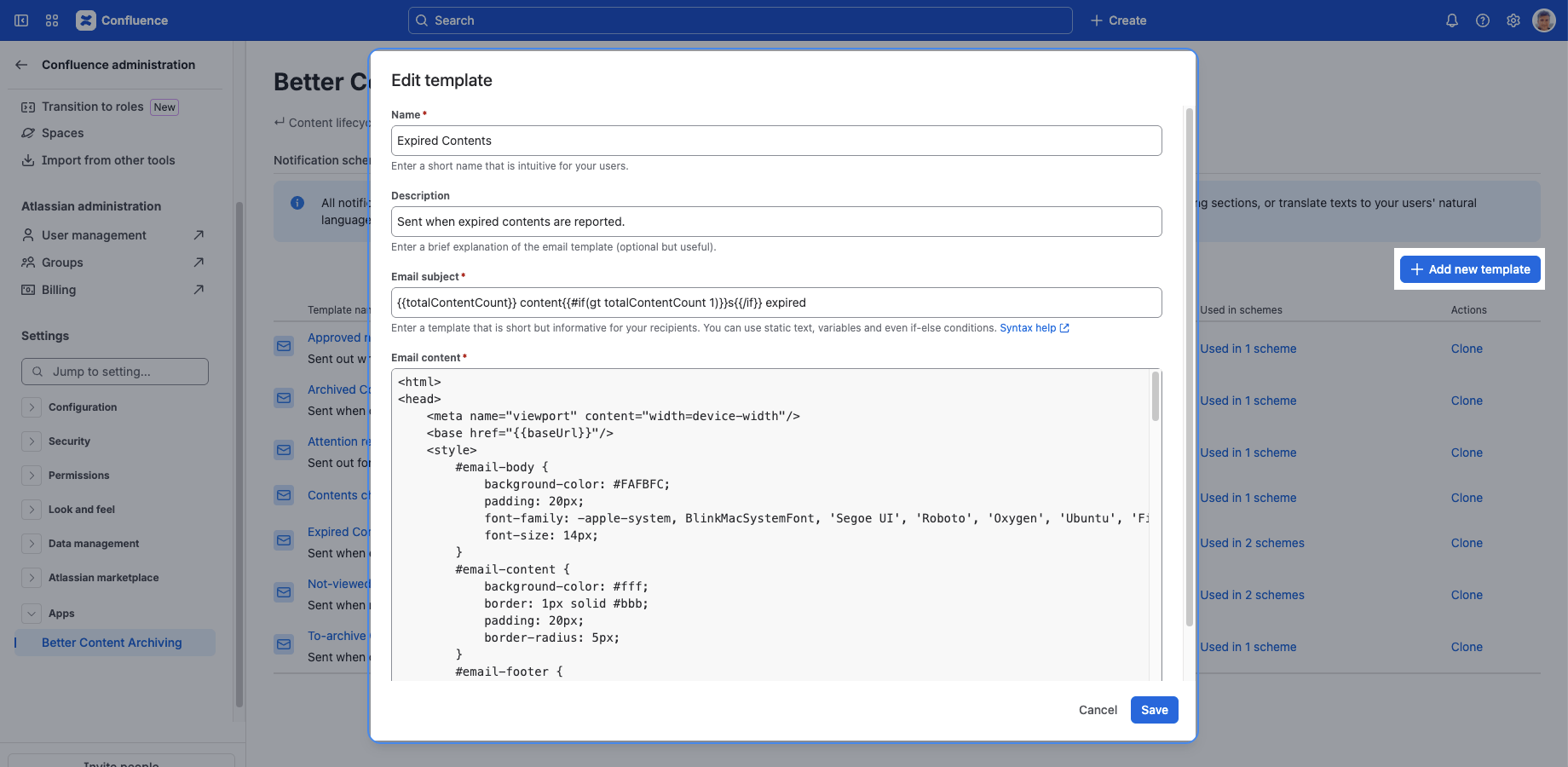
In the editor dialog, you can configure the following:
Name: Enter a name for the notification email template. Keep it concise and intuitive for users. It does not appear in the emails sent. It only identifies the template when editing notification schemes.
Description: Optionally, enter a description for the template. Similarly, it does not appear in the emails sent. It just explains the purpose of the template.
Subject: Enter the subject line of the notification email. It supports Handlebars expressions as template language.
Content: Enter the content of the notification email. It supports HTML markup for formatting and Handlebars expressions as template language.
Factory default notification email templates
There are factory default notification email templates for the most common use cases. To reset the factory defaults, you have to reset the notification schemes. Notification schemes and notification email templates are reset together.
Customize email subject and content
You can customize the factory default notification email templates to fit your needs, or clone them as a starting point for building your own templates.
Skip this part of the documentation if you just want to add some custom instructions to the email content, or remove or rephrase some text. You can do that without understanding the Handlebars syntax and the data types involved. Read on if you want to make significant changes to the logic, numbers, and lists.
Work with Handlebars
Handlebars is a lightweight templating language, based on Mustache, used to define the subject and content of a notification email. See the official Handlebars documentation for the full syntax reference.
You can use Handlebars expressions, written between double curly braces {{}}, to control the flow of generating a notification email's subject line and content. For example, you can iterate over lists, apply if-else conditions, and perform simple calculations.
Data types
You can use the following expressions in a template:
| Expression | Description |
|---|---|
| baseUrl |
The base URL of your Confluence site.
Useful when creating links in the email. Example (from the default notification email templates):
<html>
	<head>
		<!-- ... -->
		<base href="{{baseUrl}}"/>
	<!-- ... -->
	</head>
	<!-- ... -->
</html>
|
| totalContentCount |
The overall count of all contents processed when creating the notification.
For performance reasons, this number may be greater than the number of contents that you can actually list in the notification. Example for a typical notification email subject (note the singular vs. plural form of the word "content"): {{totalContentCount}} content{{#if(gt totalContentCount 1)}}s{{/if}} expired
|
| contents |
The contents in your Confluence site that you can actually iterate over when generating a notification.
Their backing Java data type is LimitedMap<NotificationSpace, LimitedList<NotificationContent>>.
See below for more details on these types. The following example iterates over the keys of the contents collection (whose keys are actually the spaces for which contents have been collected for the notification) in the outer each loop, and uses the key's key and name values in headings. It does so by referencing @key.key and @key.name. (The expression @key.key can be a little confusing. The first part (@key) references the map's key which is a space object, and the second part (.key) references the space's key field. These two fields are both named "key" accidentally, but they have completely different meanings.) It also prints some text with basic information. Then, it iterates over the contents listed for each space in a nested loop. It accesses contents using this, which references the current element in the outer loop. Given that the current element in the outer loop is a list in this case, it can be iterated over in a nested loop. Inside the nested loop, we can access the current content element's data. For example, @type.apiValue can be used to determine the content type (page or blogpost). Based on the type, a link is constructed that points to the content. When generating the link's label, {{title}} is used as a convenient way to access the content's title.
{{#each contents}}
	<h3><a href="wiki/spaces/{{@key.key}}">{{@key.name}}</a></h3>
	{{this.size}} content{{#if(gt this.size 1)}}s{{/if}} not viewed in {{abbreviate @key.key 23}}.
	{{#each this}}
		<div class="content-item">
			{{#if (eq @type.apiValue "page")}}
				<a href="wiki/spaces/{{../@key.key}}/pages/{{id}}">{{title}}</a>
			{{/if}}
			{{#if (eq @type.apiValue "blogpost")}}
				<a href="wiki/spaces/{{../@key.key}}/blog/{{id}}">{{title}}</a>
			{{/if}}
		</div>
	{{/each}}
{{/each}}
|
For performance and usability reasons, the email notification templates cannot access "large" amounts of data (10000 spaces, for example). Instead, they will receive size-limited views (a maximum of 20 spaces are detailed, with a maximum of 50 contents listed for each) of the data as instances of the following collection types:
Limited collection types
| Type name | Description |
|---|---|
| LimitedList |
A size limited decorator for the Java List type. Think about it as a list that maximizes the number of items it actually holds, but also knows the total number of items it would contain if it were non-limited. Example: when the list receives 135 items, 100 as max size, then it will return 100 items and 35 as the remaining count. It extends the java.util.List interface with:
|
| LimitedMap |
A size limited decorator for the Java Map type. It has the semantics with map entries, as LimitedList has with the list items. It extends the java.util.Map interface with:
|
DTO types
The items in the above collections are lightweight DTO objects of the following types:
| Type name | Description |
|---|---|
| NotificationSpace |
A lightweight replacement for a Confluence Space. Available fields:
|
| NotificationContent |
A lightweight replacement for a Confluence content (page or blog post). Available fields:
|
Helpers
Handlebars is a "logic-less" templating language, but it supports the definition of so-called helpers. Helpers are expressions that can be used in a template to implement simple logic like comparing two values or evaluating a true/false condition, backed by custom built-in functionality in the service that parses the template.
Handlebars offers block helpers and built-in helpers out of the box. Complementing these, the Better Content Archiving app introduces the following helpers that you can also use in your templates.
| Helper | Description |
|---|---|
| abbreviate |
Abbreviates a string to a given length (at least 4).
Appends '...' to the end of the string.
This suffix counts against the overall length the string is abbreviated to.
Uses StringUtils.abbreviate() under the hood.
{{abbreviate "long string" 6}}
|
| and |
Logical AND operator.
Takes a list of expressions.
Evaluates to true if all expressions are true, or false otherwise.
{{#if (and (gt contents.size 0) (gt totalContentCount 10))}}
	There is at least one space listed, and there are at least 11 contents overall
{{/if}}
|
| eq |
Logical EQUALS operator.
Takes two expressions.
Evaluates to true if they are equal, false otherwise.
{{#if (eq contents.size 1)}}
	There is exactly one space listed
{{/if}}
|
| gt |
Logical GREATER THAN operator.
Takes two values.
Evaluates to true if the first is greater than the second, false otherwise.
{{#if (gt contents.size 1)}}
	There are at least two spaces listed
{{/if}}
|
| gte |
Logical GREATER THAN OR EQUALS operator.
Takes two values.
Evaluates to true if the first is greater than or equal to the second, false otherwise.
{{#if (gte contents.size 2)}}
	There are at least two spaces listed
{{/if}}
|
| lt |
Logical LESS THAN operator.
Takes two values.
Evaluates to true if the first is less than the second, false otherwise.
{{#if (lt contents.size 10)}}
	There are less than 10 spaces listed
{{/if}}
|
| lte |
Logical LESS THAN OR EQUALS operator.
Takes two values.
Evaluates to true if the first is less than or equal to the second, false otherwise.
{{#if (lte contents.size 10)}}
	There are no more than 10 spaces listed
{{/if}}
|
| ne |
Logical NOT EQUALS operator.
Takes two expressions.
Evaluates to true if they are not equal, false otherwise.
{{#if (ne contents.size 0)}}
	There is at least one space listed
{{/if}}
|
| not |
Logical NOT operator.
Takes a boolean expressions.
Evaluates to the opposite of the expression, i.e. to true if the original value was false, and to false if the original value was true.
{{#if (not (eq contents.size 0))}}
	There is at least one space listed
{{/if}}
|
| or |
Logical OR operator.
Takes a list of expressions.
Evaluates to true if any of the expressions is true, or false otherwise.
{{#if (or (gte contents.size 2) (gt totalContentCount 10))}}
	There are at least two space listed, or there are at least 11 contents overall
{{/if}}
|
Combine and nest the above helpers to create complex conditions:
and (gt contents.size 0) (gt totalContentCount 10)
Error handling
If your email template contains Handlebars syntax errors, the notifications won't be sent, and an error will be logged for the job execution trying to send that notification. You can see the error by clicking the Logs link shown on the Jobs screen after the execution completed, or in the Job audit log.
Recipes
This section contains easy-to-follow guides to solve frequent use cases.
Display the current status for each content
If you are sending a notification email that includes multiple different statuses, such as "Expired", "Expiration date passed", and "To review", it is useful to display the current status next to each content:
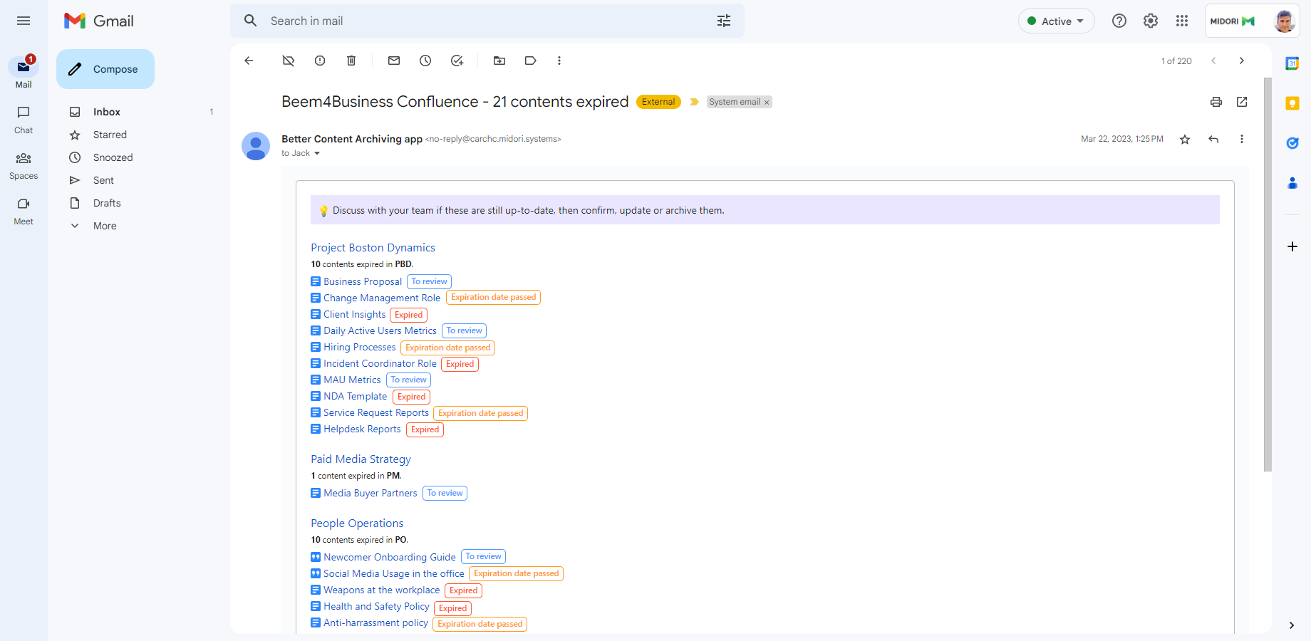
Steps:
-
To define the appearance of the status label, add the following fragment to the <style> section:
<style>
	<!-- ... styles omitted -->

	<!-- add this fragment -->
	.content-status {
		margin: 0 0.5em;
		padding: 0 0.5em;
		font-weight: 500;
		font-size: smaller;
		border: 1px solid;
		border-radius: 5px;
		height: 100%;
	}
</style>
(You can freely customize the style!) -
To display the status, add the following line to the end of the section which displays a single content:
<div class="content-item"> <!-- ... code omitted --> <!-- add this line --> <span class="content-status" style="color:{{status.color}}">{{status.name}}</span> </div> - You're done!
Display the last content status transition for each content
If you are sending a notification email which focuses on transitions (content status changes), it is useful to display both the previous status and the current one:
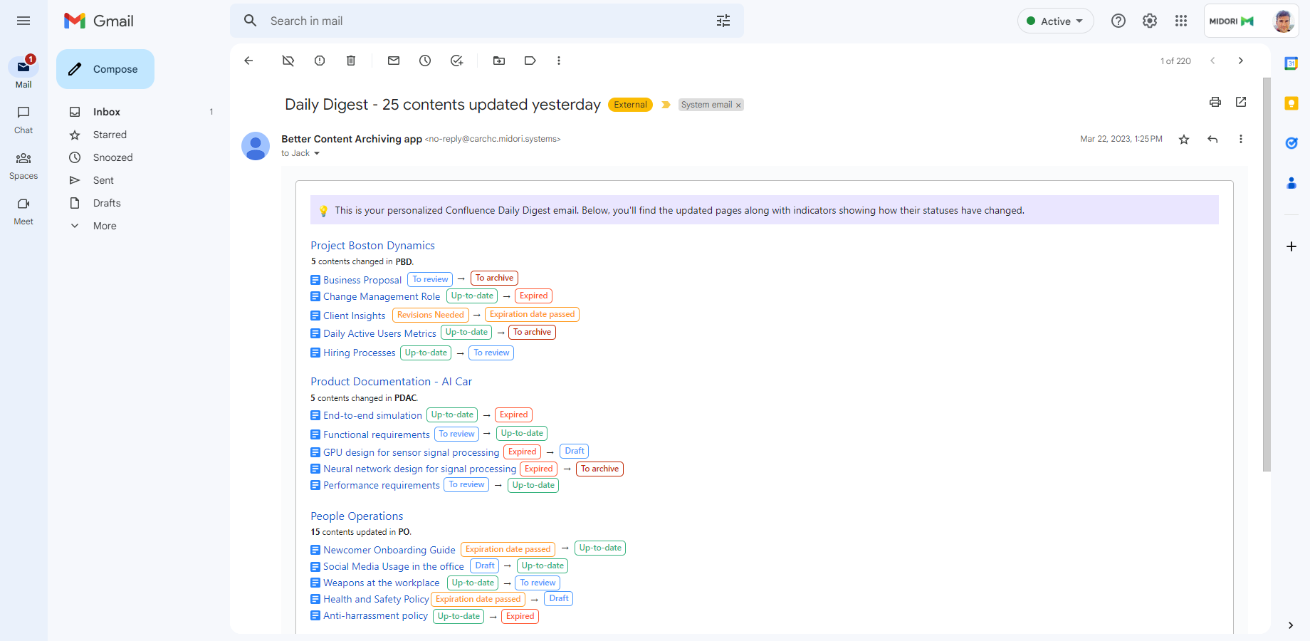
Steps:
- Add the style the same way as in step 1 of the previous recipe.
-
To display the previous status, an arrow character and the current status, add the following fragment to the end of the section which displays a single content:
<div class="content-item"> <!-- ... code omitted --> <!-- add this fragment --> {{#if previousStatus}} <span class="content-status" style="color:{{previousStatus.color}}">{{previousStatus.name}}</span> <span>→</span> {{/if}} <span class="content-status" style="color:{{status.color}}">{{status.name}}</span> </div> - You're done!
Questions?
Ask us any time.